Custom Tableware Color Matching: Buyer Approval Guide
A factory-side guide for importers, brands and retail buyers who need one visual identity across a plastic lunch box, metal cutlery, textile bag and printed packaging—without treating unlike materials as though they receive color in the same way.
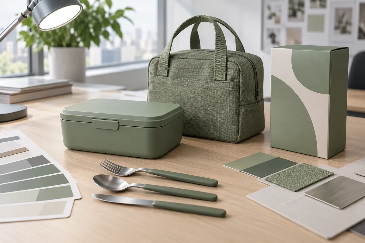
Custom tableware color matching is not a request to make four materials mathematically identical. It is a controlled approval process that decides what “coordinated” means for a specific product, finish, retail environment and brand standard. A molded PP lid reflects light differently from a woven bag, and both will look different beside ink printed on uncoated paperboard.
From the factory side, the most expensive color problem usually begins before production: the buyer supplies a color code but leaves the material, gloss, viewing light and approval sample undefined. Each component can then be “close” to the same reference while the assembled set still looks inconsistent. The remedy is to approve color as a system, with clear ownership of every decision.
Why custom tableware color matching fails across a complete set
Color is produced by a combination of pigment or ink, base material, surface geometry and light. Even when two suppliers start from the same reference, a matte molded surface scatters light, brushed steel creates directional highlights, fabric creates shadows between yarns, and paper absorbs ink. A buyer who compares isolated samples on different days may miss the mismatch that becomes obvious when the final set is packed together.
Another common failure is using the wrong development sequence. Packaging may be printed before the plastic color is stable, or the textile may be dyed before the buyer decides whether the molded part should be warmer or cooler. Later adjustments then move one component closer to the target but farther from the rest of the approved family.
Decoration adds a second layer of risk. A logo printed on a dark box, laser-marked on steel or woven into a label does not behave like the same artwork on a white screen. Buyers should separate the body-color decision from the decoration-color decision, while still reviewing both on the assembled product.
Start the Pantone color approval with a material map
Before asking for samples, list every visible part and how its color will be created. The map should distinguish molded resin color, coating, anodizing or paint, textile dye, webbing, zipper tape, print ink, laminate, label and carton board. It should also identify neutral components that are intentionally not matched, such as natural stainless steel or a black zipper pull.
Define the custom tableware color matching target
The target can be a recognized color reference, a buyer-supplied physical chip, an existing product, or a signed development sample. State which reference has priority if they conflict. A physical object that has aged, yellowed or been photographed under colored light should not silently become the production standard.
Then define the intended relationship between materials. Some programs require the plastic and bag to feel like one close family, while others deliberately use a tonal system—for example, a mid-tone container, darker webbing and a lighter carton background. Writing this intent down gives the factory a better goal than chasing an impossible one-to-one match.
Record the finish at the same time as the hue. Glossy, satin, matte, textured and translucent surfaces can make the same pigment formulation appear lighter, darker or more saturated. If a texture changes after color approval, the sample should be reviewed again because the visual result has changed even when the formulation has not.
Four material routes create four different approval questions
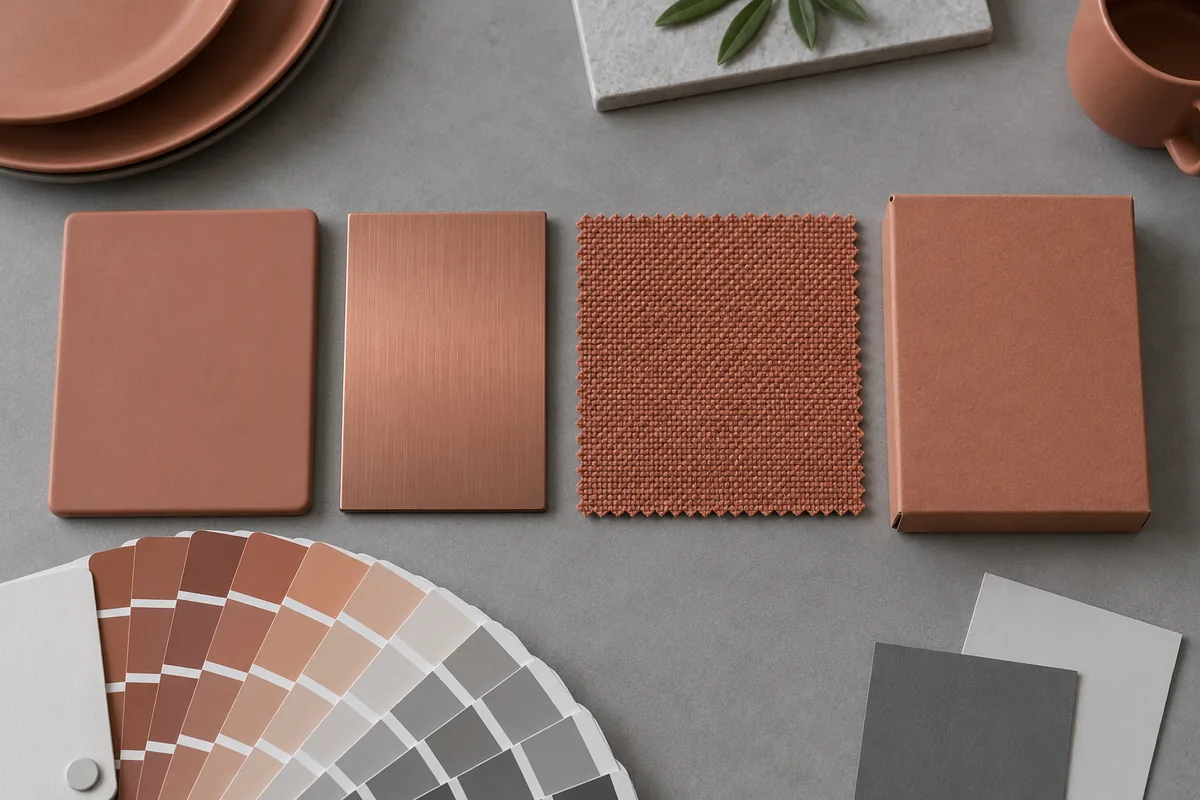
The table below is a procurement comparison, not a universal tolerance specification. The actual route depends on the selected product, supplier capability, finish and market requirement. Buyers should ask what sample is representative of the planned process before treating it as a production master.
| Component route | What changes the appearance | Useful approval evidence | Buyer decision |
|---|---|---|---|
| Colored PP or other molded plastic | Base resin, pigment, wall thickness, texture, gloss, recycled or composite content, and molding conditions | Material plaque for direction, then an actual molded component in the intended resin and finish | Approve the visible priority surfaces and state whether small hidden areas may vary |
| Stainless-steel part with color detail or coating | Metal preparation, coating type, film thickness, brushing direction, reflectivity and cure | Flat coupon for early screening, followed by the actual formed or decorated part | Decide whether the metal should match the plastic or function as a coordinated accent |
| Textile bag, lining, webbing and zipper | Fiber, yarn, weave, dye lot, pile, backing, stitching and the contrast between adjacent trims | Swatches for shortlisting, then a sewn bag sample using nominated materials and trims | Approve the complete bag, not only the largest fabric panel |
| Retail sleeve, color box or label | Paper whiteness, coating, ink system, laminate, print process, trapping and surrounding artwork | Contract proof or material drawdown, then a production-representative printed sample | Specify whether the package should match the product or present a deliberately adjusted brand color |
Early plaques, coupons and swatches are efficient because they allow direction to change before a full sample is assembled. They are not always sufficient for final approval. Curves, ribs, weld lines, brush direction, seams and printed graphics can shift perception, so the last decision should use a representative part or complete set.
Transparent and semi-transparent materials require an additional rule: define what sits behind the sample during review. A translucent lid viewed over white paper can look different when placed over food, a dark insert or an empty container. The same principle applies to mesh, thin textile and windows in retail packaging.
How should buyers compare color samples under controlled light?
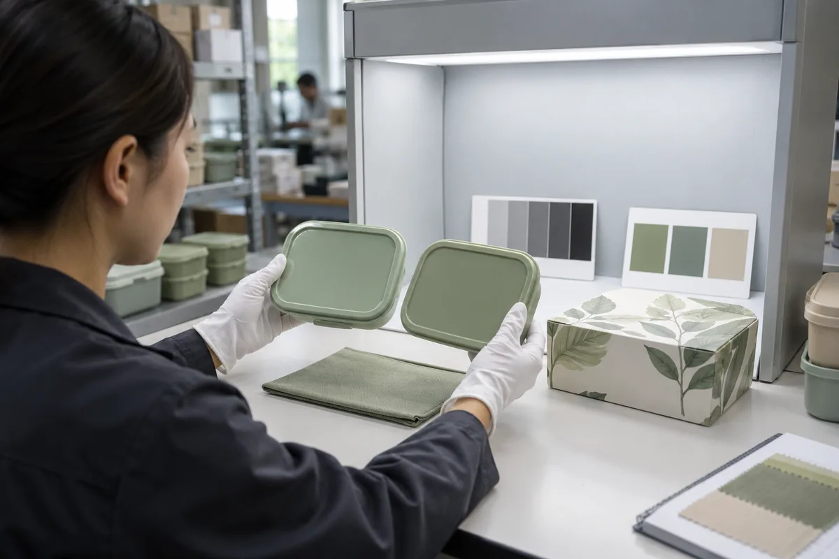
Use the same neutral viewing environment for each approval round. Daylight is useful, but daylight changes with time, weather, window glass and surrounding walls. A controlled light source or light booth improves repeatability, while a second relevant retail or office light can reveal whether two materials separate under another common condition.
Place the actual components side by side in the orientation in which the customer will see them. Compare the lid next to the bag, the cutlery handle next to the tray, and the product next to the printed pack. Do not judge a textile swatch in one room and a plastic lid from a phone photo in another.
Let samples reach the same ambient condition and remove strongly colored surroundings. Glossy parts should be tilted through normal viewing angles because a highlight can hide a hue difference or make a dark sample appear lighter. If the buyer uses an instrument, its data should support the agreed visual method rather than replace a decision that was never defined.
Use a pass, adjust or reject decision
Every review should end with a clear status. “Pass” means the exact sample and revision can become a reference; “adjust” states the direction and requires another submission; “reject” explains the mismatch and prevents accidental use. Comments such as “a little better” are too ambiguous for release.
When asking for an adjustment, describe the relationship rather than relying only on subjective words. State which material is too warm, cool, light, dark, dull or saturated compared with the named master, and identify the surface and light in which the difference matters. Send marked photographs for location context, but keep the physical sample or agreed measurement as the governing evidence.
Where visual tolerance should be strict—and where it can be practical
Not every surface needs the same acceptance level. A lid and base joined along one visible seam may need a close relationship, while an interior divider can accept more variation if it is rarely seen beside the exterior. A buyer can control cost and revision time by naming priority zones instead of demanding an undefined perfect match everywhere.
High-visibility brand areas include the top lid, front bag panel, webbing handles, retail pack face and any logo background. Lower-priority areas may include internal ribs, underside features, concealed lining or transit packaging. This hierarchy should be agreed before samples are quoted because it affects material selection and the number of components that require special control.
Lot-to-lot variation also needs a commercial rule. Natural fibers, recycled-content materials, textured composites and different print substrates may show variation even with controlled inputs. The buyer should ask what can reasonably be controlled for the chosen route, then approve a representative standard or limit samples rather than importing an unrelated tolerance from another material.
Do not publish a numerical tolerance simply because it looks precise. Instrument geometry, color space, illuminant, sample opacity and measurement location can change the result. If numerical criteria are needed, they should be connected to the actual materials, device method and approved visual outcome in the project specification.
Build a color master that survives production handoffs
After approval, create a controlled master set. Label each component with the project or SKU, material, finish, color reference, revision, approval date and approver. Store a protected reference with the buyer or project owner and another with the manufacturing team when practical, so both sides can trace what was released.
A multi-material program may need more than one physical master. The molded lid can govern plastic, a signed swatch can govern textile, and an approved printed sample can govern packaging. The complete assembled sample then controls the visual relationship among those masters.
Production changes should trigger a review rule. A resin grade change, new pigment source, coating change, new fabric mill, different paperboard, artwork revision or supplier transfer can alter color. The release document should state which changes require resampling instead of leaving that decision to memory.
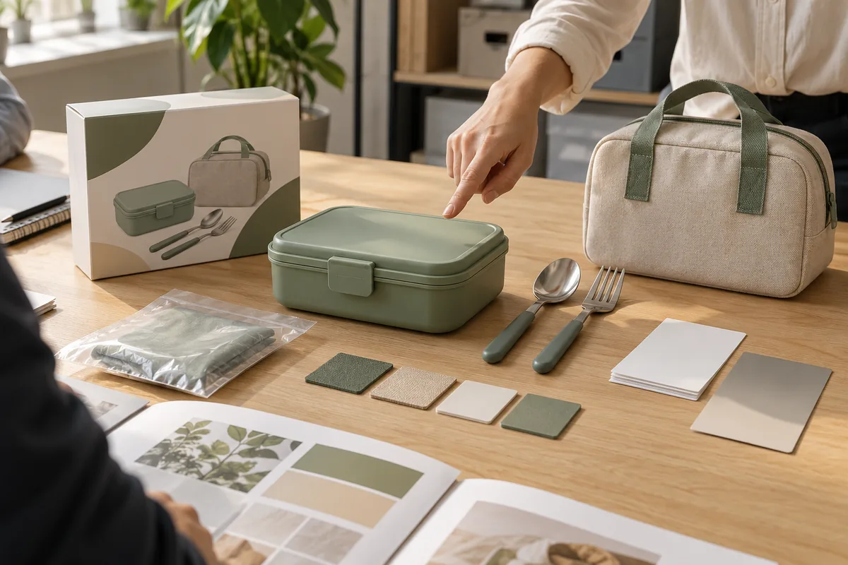
Photographs remain useful for communication and change records, but camera white balance, exposure and screen calibration make them poor sole standards. Photograph the sample with a neutral reference and revision identifier, then link the image to the physical master. If samples must be shipped between countries, agree who retains the governing sample and how duplicates are reconciled.
Buyer checklist for a tableware Pantone color approval brief
This checklist helps a brand or importer prepare an actionable request before the first color sample. It does not replace a product-specific specification, because the supplier still needs to confirm the feasible route for the selected SKU, material and process.
| Check | Question | Why It Matters |
|---|---|---|
| Target reference | Is the master a color code, physical chip, existing product or approved sample? | It prevents different teams from following competing references. |
| Component map | Which plastic, metal, textile, trim, label and packaging parts are visible? | Small unmatched parts can make an otherwise coordinated set look unfinished. |
| Material and finish | Are resin, coating, fiber, weave, paper and gloss defined for each part? | Appearance cannot be separated from substrate and surface. |
| Relationship | Must parts be a close visual match, a tonal family or deliberate accents? | The factory needs a design intent, not only a number. |
| Viewing method | What light, background and orientation will be used for approval? | Consistent conditions make repeated reviews comparable. |
| Priority zones | Which surfaces and adjacent components receive the strictest review? | It focuses control where customers actually see the brand. |
| Sample stage | Is the submission a directional plaque, actual part, decorated sample or complete set? | It stops an early screening sample from being mistaken for final evidence. |
| Decision record | Who can pass, adjust or reject, and how is the revision recorded? | One release owner prevents conflicting comments and accidental production. |
| Change control | Which material, supplier, finish or artwork changes require reapproval? | The approved appearance can otherwise drift after handoff. |
| Commercial inputs | Are target quantity, market, packaging format and schedule available? | The feasible sample and production route depends on the real program. |
When a buyer should request a new color sample
Request a new sample when the approved material or process is not represented by the current one. A flat plastic plaque may be enough to choose between two directions, but it should not automatically release a textured molded lid. Likewise, a digital package proof should not release a print run if substrate and finishing materially affect the color.
Resample after a meaningful change to resin, pigment, coating, finish, fiber, dye route, trim, paper, laminate or printer. A different component supplier can also justify review even when the reference number remains the same. The point is not to create paperwork; it is to catch changes before they are multiplied across a purchase order.
Buyers should also resample when the set composition changes. Adding a bag, steel accessory or new carton places the existing color beside a new material, and that relationship may reveal a mismatch that was acceptable in isolation. The approval should follow the commercial SKU that customers will actually receive.
Frequently asked questions about custom tableware color matching
Can plastic, metal, fabric and printed packaging look exactly the same color?
They can be coordinated to an agreed visual standard, but their surface, gloss, texture and production route affect appearance. Approve each material-specific sample as part of one set rather than expecting a single reference number to erase every visible difference.
Is a digital screen reference enough for color development?
No. Screens vary, and emitted screen light is different from light reflected by a physical product. Use the digital file to communicate direction, then use a physical reference and representative samples for approval.
Which sample should become the color master?
Choose the sample that best represents the intended product and can be stored and reproduced reliably. For a multi-component set, keep material-specific masters or a signed complete-set sample so every component retains a traceable reference.
When should color be approved in a custom tableware project?
Approve it after the actual material, finish and process are sufficiently representative, and before mass-production materials or decoration are committed. Reconfirm when a material, texture, supplier, finish, artwork or process changes.
What should a buyer send for a Pantone color approval request?
Send the color reference, material and finish for every component, artwork files, viewing expectations, priority surfaces, packaging substrate, quantity, market and schedule. Identify which physical sample will govern production and who can issue the final release.
Conclusion: approve a color system, not isolated parts
Custom tableware color matching becomes manageable when the buyer treats it as a sequence of documented decisions. Define the target and desired relationship, map how every material receives color, screen early swatches, review representative components together, and preserve identified masters for production. This approach gives the supplier a clear standard and gives the buyer a defensible approval record.
For a Naike Tableware project, send the selected product or set direction, target quantity, destination market, brand color reference, material preferences, artwork and packaging requirement. The team can then review which samples and decisions are needed for that specific SKU without assuming a universal MOQ, timing, tolerance or test claim.
Editorial note: the images in this guide are original conceptual visuals created to explain color-approval decisions. They are not test records, certification evidence or photographs of verified Naike production results.